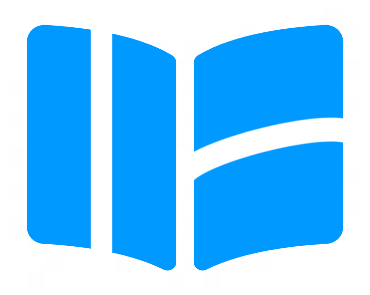
The Wurkbuk logo has now evolved and has way more meaning. It started out being a simple book icon, which represented a student's school workbook. This was originally taken from Font Awesome, which is a collection of icon fonts created by Dave Gandy. With the addition (or subtraction) of two simple lines, it has become filled with considerably more meaning, signifying what Wurkbuk is and stands for. In this post I'll explain exactly what that is...
The first representation of the logo is the most straight forward and can be see by the image below. It's simply the initials WB which stand for Wurkbuk.
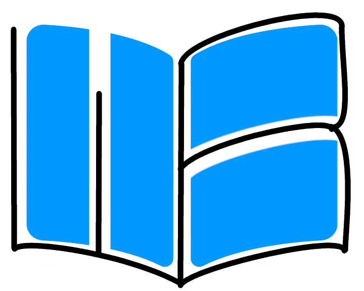
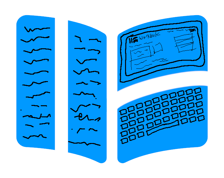
The second is the logo representing a paper workbook on the left, and the digital alternative of a computer (monitor and keyboard) on the right. Meaning that learning is moving from paper to digital.
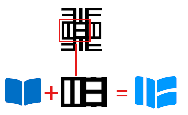
The final, most important, and the real reason for the two lines, which made the above two representations possible is the merger with the Adinkra symbol Nea Onnim.
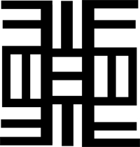
Adinkra symbols are Ghanaian symbols that represent concepts, ideas and general truths about life. There are hundreds of symbols and each has a specific meaning. The Adinkra symbol above, Nea Onnim is a symbol of knowledge, life-long education and the continued quest for knowledge. The literal meaning and translation of Nea Onnim is 'The one who does not know'. However, this is only part of the longer phrase which is
Nea onnim no sua, ohu; nea odwen se onim dodo no, se ogyae sua a, ketewa no koraa a onim no firi ne nsa.
which means
He who does not know can become knowledgeable from learning; he who thinks he knows and ceases to continue to learn will stagnate.
Instead of using the whole Adinkra symbol, I chose to use just the middle left part and merge it with the original Wurkbuk logo to make something more unique.
So, there you have it. Wurkbuk's new logo and the meanings behind it.